Leopard review part 4: New features: Quick Look, Time Machine, Spaces
Apple’s latest Mac operating system, Leopard, has, we are told, over 300 new features. Many of these are minor, but in this part of my Leopard review I’ll concentrate on three of the big ones: Quick Look, Time Machine, and Spaces.
Quick Look
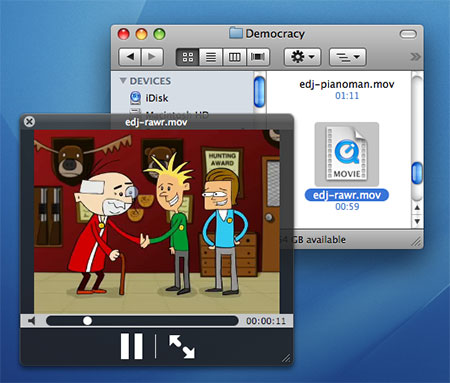
One of the nicest new features for me is Quick Look. Select any file in a Finder window, press the spacebar, and you’re instantly previewing the file in Quick Look. “Quick” is the operative word here; whereas it might take you 10-20 seconds to fire up Microsoft Word or NeoOffice to view a .doc file, with Quick Look you’re viewing it within 1 second of hitting the spacebar.

Exactly how the preview looks depends on the type of file:
- Text files – whether that’s Word documents, PDFs, or plain text – open with a viewer that lets you scroll up and down through the whole document.
- When previewing images, you get an Add to iPhoto button to add the displayed image to your iPhoto library.
- An audio or movie file opens with a play/pause button and a scrubber control for jumping around within the content.
- Font files display the entire alphabet rendered in the font
… and so on. In all cases, you can click a button to view the file in full-screen mode and, if you Quick Look multiple files at once, you can view a contact sheet of thumbnails to choose from (this, combined with the full-screen mode, looks great with photos!).
Quick Look uses plug-ins to work its magic; each file type needs an associated plug-in to be rendered in Quick Look. Naturally, Leopard ships with plug-ins for most common file types, and app developers are adding more all the time.
This is a wonderful way to quickly double-check that you’ve found the file you’re after, without having to launch an application. It’s a real time-saver. I just have to train myself to use it – currently I still instinctively want to double-click a file to open it.
Time Machine
According to Apple’s own research, 96 percent of Mac users don’t back up their data regularly. Terrifying. Usually the reason given is that it’s just too damn hard.
The beauty of the new Time Machine feature is that you no longer have an excuse to avoid backing up your stuff – apart, that is, from spending a couple of hundred bucks on an external hard drive. Simply plug in the drive, and Time Machine asks if you want to use it as your backup drive. Click Use as Backup Disk, and… well, there is no “and”. That’s it. Your backup is now under way, captain.
Time Machine backs up every hour. It stores hourly backups for the last 24 hours, then daily backups for the last month, then weekly backups until it runs out of disk space. Of course, it only backs up files that have changed, to save space. Unfortunately it can’t do differential backups of files, which means that if you open an 8GB Parallels virtual machine regularly (for example), then a new 8GB backup copy of the VM file is created every single time. You can, at least, exclude certain files from the Time Machine backup.
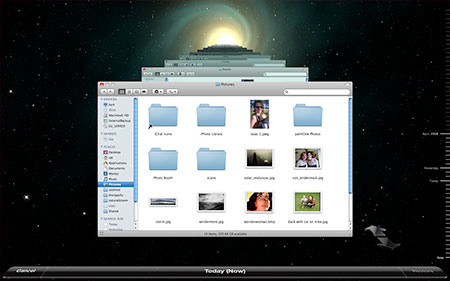
Backups happen quietly in the background, indicated by a little spinning Time Machine icon in the menu bar. Restoring from a backup, however, is far from inconspicuous. Open Time Machine, and you’re greeted with a scene that looks like something out of Doctor Who. The current Finder window (or whatever Time Machine-enabled app you’re currently running; currently you can also restore from within Mail and iPhoto) is displayed in the foreground, with different versions of the window fading backwards in time. By clicking an older window, or using the slider on the right, you can “step back in time” to recover the file, email, or photo you were after.

It’s all very swish, but is it really necessary to have all that swirling stuff? Yes, according to John Gruber, who says:
“Apple has made something so effect-laden and so extraordinary that users want to see it in action — the fact that that something is backups, which, let’s face it, is effectively a chore, is a noteworthy achievement. Making backup software that people can’t wait to try, and which, once activated, just automatically kicks in and does its thing on a regular schedule, is like making people want to go ahead and sign up for life insurance.”
Personally, I find the spacey background overkill – just let me get to my backups already! – but I can see John’s point. If it gets regular users backing up their data regularly then it has to be a good thing. I certainly prefer it to my previous technique of mucking about with rsync to do my backups – it’s (hopefully) just as reliable, it’s quick, it’s easy, and it looks pretty. All in all, a fine addition to the Mac (and external hard drive makers are no doubt happy with its inclusion, too).
Spaces
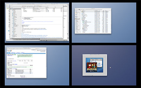
Of all the new Leopard features, Spaces is probably the least original. Apart from a few niceties and typical Apple swish-ness, it’s basically just a multiple workspace manager along the lines of You Control: Desktops, CodeTek VirtualDesktop, and the window manager of practically every non-Mac UNIX variant known to mankind.

Still, it’s nice to see native support for those folks who actually use multiple workspaces (I don’t). Some cool touches include the ability to zoom out, Exposé-style, to see all your workspaces at once (at which point you can drag windows between workspaces), and the way you can assign an app to a specific workspace, so that it always launches in that workspace.
Summary
Leopard’s brand new apps range from the downright useful (Quick Look, Time Machine) to the useful-if-you-need-that-sort-of-thing (Spaces). Of the three, Time Machine is probably the one that will have the biggest impacts on the average user’s computing habits. My personal favourite is Quick Look, which is a simply lovely way to find the file you’re looking for. Nice work Apple.


May 1st, 2008 at 1:35 am
I love QuickLook. I’ve been completely retrained now to use it, and feel as lost without it as I do without Expose. Worth £80 all on it’s own..