Archive for the 'Mac OS' Category

Who will buy OS X ‘Snow Leopard’?

Friday, June 13th, 2008

The next version of the OS X operating system10.6 “Snow Leopard” – was quietly announced at WWDC08 at the start of this week. Unlike previous versions, 10.6 will not focus on new features (though doubtless there’ll be a few here and there). Instead, Apple have decided to concentrate on making the OS leaner, meaner and all-round nicer. (Maybe this is how they came up with the name: It’s a slicker Leopard, but they’ve frozen the features. Feature freeze? Snow? Never mind…)

They’ll do this by:

  • Making it easier for developers to code apps for multi-core processors, using a technology called “Grand Central”
  • Introducing Open Computing Language (OpenCL), which lets applications use the Mac’s GPU (graphics processing unit) almost as an additional CPU
  • Increasing the RAM limit to 16 terabytes (16,000 GB) – a limit not likely to be reached anytime soon
  • Including QuickTime X, which will run all your latest codecs much more smoothly (so they say)
  • Making Safari run JavaScript “up to 53 percent faster” apparently – which will be good for all those AJAX-driven websites
  • Reducing the OS’s footprint (i.e. the hard drive space it takes up). This has caused a bit of controversy as many think this means dropping support for PowerPC Macs, but this remains to be seen. Maybe they’ll ship 2 versions: one for Intel, one for PowerPC?

One new feature they are announcing now is full support for Microsoft Exchange using the Exchange Web Services protocol. This will let Mail, Address Book and iCal play nicely with Exchange servers. (more…)
Leopard review part 9: Random stuff and conclusion

Tuesday, May 13th, 2008

Well this review of Mac OS X Leopard could fill a book, so I’m going to wrap things up now. I’ll briefly talk about other new features of note, and attempt to reach some sort of conclusion about the latest Mac OS.

iChat

Apple have added tons of snazzy new features to iChat AV. Major ones include Photo Booth-style effects, the ability to have a picture or movie backdrop, screen sharing, audio/video chat recording, tabbed chats, and iChat Theater – a feature that lets you show movies, Keynote presentations and other media to your chat buddy while you’re talking to them. I haven’t had a chance to use most of these new features yet, but the backdrop effect is quite fun – though the backdrop tends to leak through quite a bit. One simple but nice improvement is that the Buddy List window now allows buddy groups, making it much easier to organize your list of buddies.

Safari

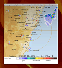
The Web Clip widget in Leopard's Dashboard

I was already using Safari 3 on Tiger, so there’s not much new here. The only difference appears to be the Open in Dashboard button/menu option that lets you capture part of the current page and save it as a Web Clip Dashboard widget. This is a very handy feature in certain situations – for example, I use it to display the current Sydney weather radar on my Dashboard for quick access, as shown on the right. (Looks like a storm brewin’ in the Pacific!)

However, the widget doesn’t work so well with things like AdSense report pages that require a login. When your login times out, the widget can’t cope with the changed page and freaks out. (more…)

Leopard review part 8: Front Row

Sunday, May 11th, 2008

In my ongoing Leopard review I’m currently looking at the Apple applications that are bundled with Mac OS X – at least, the apps that I personally use on a regular basis.

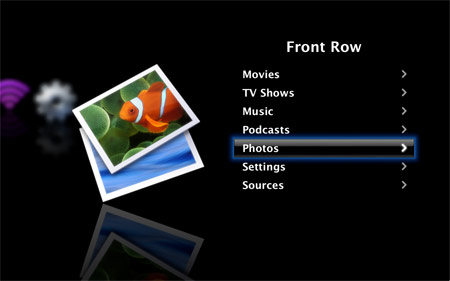
I was going to write about just Mail, iCal and Preview, but then I remembered there’s another app that I use that has had major changes in Leopard: Front Row. We actually use Front Row fairly extensively; we don’t have a TV (shock horror!), so we watch DVDs and a lot of video podcasts on the living room iMac, as well as listen to music on it (streamed from the iTunes on my Mac).

Front Row in Mac OS X Leopard

So is the new Front Row a step forward like Preview, or is it one step forward, two steps back, like Mail? Let’s see.

The good

On the plus side, the daft swirly effect when you launch/exit Front Row is replaced by a simple fade, which makes for a smoother transition to Front Row and back. The new Front Row interface on the whole is slicker – much like the Apple TV interface, in fact.

The fonts are a lot smaller than Tiger’s Front Row, so if you plan to watch movies on your MacBook from across the room, you might be squinting a bit. On the other hand, this means that you can see more of song/movie titles while you’re browsing. Even better: When browsing, the titles for both audio and video media now scroll horizontally if they’re too long to display in one go. This feature is wonderful, as I’m no longer having to play “guess the podcast” with long podcast titles, for example.

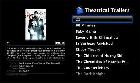
Viewing theatrical trailers is generally a nicer experience in Leopard’s Front Row. You now get some blurb about each movie as you’re browsing it (replete with the occasional HTML character code – oops!), and you can also see the download progress of a trailer as it loads – a feature sorely missing in Tiger. However, in Tiger you browsed movies by poster artwork – a nice, intuitive way to find movies. Now you just get a list of titles, and you can only view the poster for the currently selected movie.

Browsing theatrical trailers in Leopard’s Front Row

Another nicety is that Front Row can now play a VIDEO_TS folder from a ripped DVD – handy if you like to have your movies on your hard drive. In Tiger you had to resort to a hack to get this working. (more…)

Leopard review part 7: Preview

Thursday, May 8th, 2008

Many of the core applications in Mac OS X have been significantly upgraded in Leopard. I’ve already taken a look at Mail and iCal in my review. Here I’ll concentrate on Preview, Apple’s PDF and image viewer.

As the built-in apps go, Preview is a bit of an unsung hero. It pops up when you view a PDF, then you close it when you’re done – you don’t tend to think about it much. However, it’s a supremely useful and well-written application, and with the release of Leopard, it’s now even better.

Preview in Leopard

Annotation

Preview in Leopard has vastly improved annotation features. You can highlight text, and add sticky notes, ovals, rectangles, and URL links. (I was disappointed that you can’t constrain ovals to circles and rectangles to squares, but hey, you can’t have everything I suppose.) You can add your name to annotations too (enabled by default in Preferences > General). All annotations are retained when you save the PDF.

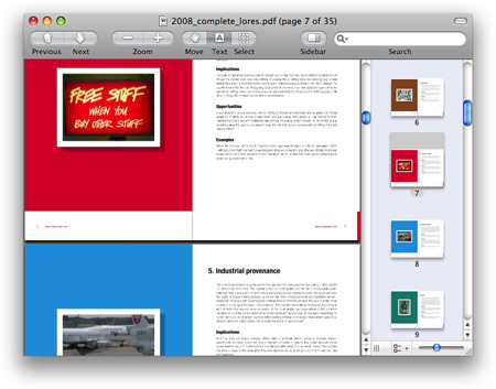
Here I highlighted some text in a PDF (which, by the way, is from the excellent book Future Files, by my good friend Richard Watson), and also added a note:

Adding a note and highlighting text in Leopard’s Preview

PDF editing

You can move or delete pages within a PDF, and combine PDFs using drag and drop. Although you can’t create PDFs from scratch or edit the actual text of a PDF, these basic editing features are still useful for those times when you want to make a quick change. (more…)

Leopard review part 6: iCal

Monday, May 5th, 2008

My epic Leopard review continues. At this rate I’ll have to give it its own blog category.

Today I’ll take a look at iCal, the calendar/task manager app that ships with Mac OS X.

I’ve bitched about Tiger iCal’s hideous user interface before – particularly its heinous lack of keyboard shortcuts for basic tasks. So does Leopard’s iCal mark an improvement over Tiger’s?

Well, yes and no. The iCal interface has had a makeover, and definitely looks and feels slicker than Tiger’s iCal. In addition, as with the new Mail, the interface feels more responsive, too.

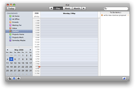
The new iCal in Leopard

Unfortunately, the interface, despite its makeover, still sucks like a fleet of Hoovers. In fact – and Apple have had to try really hard here – the new interface is even less usable than Tiger’s. (more…)

Leopard review part 5: Mail

Saturday, May 3rd, 2008

Along with all of its 300 spiffy new features, many of the bundled Apple applications have had a makeover with the release of Leopard. In this multi-part review I’ll be concentrating on three of the main ones: Mail, iCal, and Preview. In this part: Mail.

When I watched the keynote introducing Leopard a couple of years back, I remember being distinctly nonplussed by the “improvements” to Mail. Now that I have my hands on the new Mail, I am still distinctly nonplussed. In many ways, Mail is one step forward, two steps back.

First, the good news. Searching is now lightning fast, thanks no doubt to the improvements to Spotlight. I managed to search my entire mail account – some 60,000 messages weighing in at just under 2GB – in around 10 seconds. Previously this would have taken over a minute. (This, along with the improvements to Spotlight itself and the new Quick Look, all help me work faster and get more done with my Mac, which is wonderful.) In addition, the Mail interface, like the Finder’s, generally seems more responsive than it did in Tiger: windows pop open with no delay, messages render quickly, folders instantly snap open.

My issues with Mail are twofold. Firstly, the new features in Mail are, on the whole, fairly useless (for me). Secondly, the new Mail is buggier than the Mail in Tiger.

New features

New Mail features include the ability to create Notes and To-Do items, decorate mail messages with stationery, and read RSS feeds with an integrated RSS reader. Let’s take a look at each of these.

Notes and To-Dos. I’m happy that Apple finally included a decent notes feature in Mac OS X, but what on earth are Notes and To-Dos doing in Mail? To-Dos are already in iCal. Notes would surely be better as either part of iCal, or as a separate app, replacing Stickies. It’s all rather confusing. (more…)

Leopard review part 4: New features: Quick Look, Time Machine, Spaces

Wednesday, April 30th, 2008

Apple’s latest Mac operating system, Leopard, has, we are told, over 300 new features. Many of these are minor, but in this part of my Leopard review I’ll concentrate on three of the big ones: Quick Look, Time Machine, and Spaces.

Quick Look

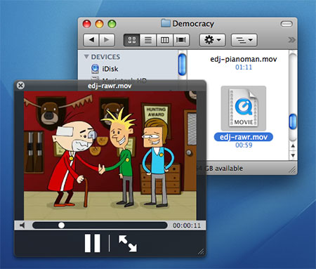
One of the nicest new features for me is Quick Look. Select any file in a Finder window, press the spacebar, and you’re instantly previewing the file in Quick Look. “Quick” is the operative word here; whereas it might take you 10-20 seconds to fire up Microsoft Word or NeoOffice to view a .doc file, with Quick Look you’re viewing it within 1 second of hitting the spacebar.

Leopard’s Quick Look feature in action

Exactly how the preview looks depends on the type of file:

  • Text files – whether that’s Word documents, PDFs, or plain text – open with a viewer that lets you scroll up and down through the whole document.
  • When previewing images, you get an Add to iPhoto button to add the displayed image to your iPhoto library.
  • An audio or movie file opens with a play/pause button and a scrubber control for jumping around within the content.
  • Font files display the entire alphabet rendered in the font

… and so on. In all cases, you can click a button to view the file in full-screen mode and, if you Quick Look multiple files at once, you can view a contact sheet of thumbnails to choose from (this, combined with the full-screen mode, looks great with photos!).

Quick Look uses plug-ins to work its magic; each file type needs an associated plug-in to be rendered in Quick Look. Naturally, Leopard ships with plug-ins for most common file types, and app developers are adding more all the time.

This is a wonderful way to quickly double-check that you’ve found the file you’re after, without having to launch an application. It’s a real time-saver. I just have to train myself to use it – currently I still instinctively want to double-click a file to open it. (more…)

Leopard review part 3: Finder and Spotlight

Tuesday, April 29th, 2008

I’ve talked about upgrading Mac OS X Tiger to Leopard, and about Leopard’s look and feel compared to Tiger’s. Here I’ll look at the new Leopard Finder, and talk about the Spotlight search feature in Leopard compared to its Tiger counterpart.

Finder in Tiger, while serviceable, always felt a bit clunky to me. Opening big folders was sluggish; the sidebar had its limitations; network shares were handled poorly. In particular, the way the entire system would hang when a network share dropped was appalling.

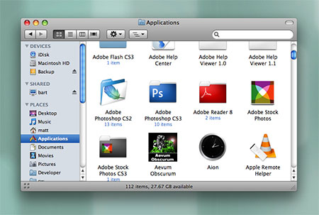
The Finder in Mac OS X Leopard

The Finder in Mac OS X Leopard

The Finder in Leopard is a definite improvement. Big folders open quickly. Preview icons take less time to render. The sidebar is nicer looking, and actually lists other computers in your network in the sidebar – this is a wonderful feature, as any network share is now only a couple of clicks away. But most importantly: No more system hangs when working with network shares! Not only do shares drop less often (despite Leopard’s Airport going up and down like a yo-yo – not sure why), but when they do, there’s no beachball for 10 minutes. This makes working on my wife’s Mac over the network actually usable now.

Going with the flow

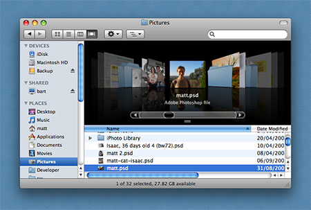
Leopard’s Finder in Cover Flow mode

Leopard’s Finder offers a fourth way to view files and folders: as well as the traditional Icons, List and Columns views, we now have Cover Flow view. This works just like Cover Flow in iTunes, but instead of viewing album covers, you see previews of the items in the current folder. In theory this is great, as you can flip through a folder’s contents without having to actually open files to view them. In practice, it’s good for things like photos, just about OK for PDFs (if you make the Finder window big enough), and pointless for applications (all you see is a huge version of the application’s icon). (more…)

Leopard review part 2: Look and feel

Saturday, April 26th, 2008

After finally upgrading both the Tiger iMacs in our house to Leopard last week, I can now see what I’m getting for my AUD $250. I’ll start with initial impressions of the new Mac OS X, then move onto specific apps and features in later parts.

The look

Leopard desktop background

Steve must have been watching a lot of Star Trek over the last couple of years. Leopard has a distinctly space-age feel, with its starry desktop background, glowing lights in the Dock, and Doctor Who-style Time Machine. Personally I’m not ecstatic about the look, but it’s inoffensive enough (though Time Machine’s animated swirly stuff is overkill and distracting).

Menu bar and Dock

The Dock in Mac OS X Leopard

I actually really like the much-maligned translucent menu bar and shiny 3-D Dock. The translucent menu isn’t as distracting as I’d imagined, and I like the “solidity” of the Dock’s shelf. I particularly like the way application windows are reflected in the shelf. Utterly pointless, but beautiful. I’m not convinced by the glowing dots used to show active apps; sure, they fit in with the space-age theme, but they’re hard to notice. I keep thinking they’re part of the starry desktop background (which I know I could change, of course). I preferred the way Tiger used a black triangle to indicate an active program.

New-look windows and icons

Finder window look in Leopard

Application windows have been unified into a consistent, reassuring dark grey shaded look. It’s a definite improvement on the mish-mash of window styles in Tiger (even amongst Apple’s own software). Leopard’s Close/Minimize/Zoom window buttons are slightly more saturated and “boiled sweet” looking than Tiger’s, and the pull-down menus in the menu bar now have rounded bottom corners – small details, but I like them.

I’m not a big fan of the Finder’s new staid blue folder icons, though they are elegant in their own way I suppose. I find the “special” folders (Desktop, Documents, Music, etc) a little hard to distinguish when they’re in the Dock. (more…)

Leopard review part 1: The upgrade process

Thursday, April 24th, 2008

I’ve put off upgrading to Leopard for months, largely due to the raft of problems and complaints from other Apple customers. Plus it didn’t seem to offer any compelling reason to upgrade from Tiger.

I finally decided that, since I blog about Macs all day long, I really should be running the latest and greatest Mac OS X. So last week I forked out for Leopard. I’ve installed it on both our iMacs and have been using it a few days. Already I have a ton of things to say, but I’ll kick off at the beginning: How well did the upgrade from Tiger to Leopard go?

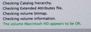
First I installed it on my wife’s iMac. I did the sensible stuff first: deactivated Photoshop (to save grief if I had to reinstall from scratch), repaired disk permissions, and verified the disk using Disk Utility on the Leopard DVD:

Verifying disk permissions

So far, so good.

(By the way, one thing you should definitely do before you upgrade to Leopard is check if you have a bit of software called Application Enhancer (APE) installed. It’s often automatically installed with other things, such as the Logitech mouse driver, so you might not realise it’s on your system. If you do have it, uninstall it, or upgrade it to the most recent version. Older versions of APE cause a dreaded blue screen of death (no, really!) when you try to boot Leopard.)

Choosing an upgrade method

The big decision when upgrading Mac OS X is: Do you do an Upgrade, an Archive and Install, or an Erase and Install? I found that Mac users seem to fall equally between the three camps, and the arguments rage. Here’s a summary: (more…)